When the application’s URL has been set and the runner is ready to work, the automation can start. First, select Automate:
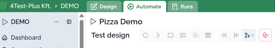
The related screen consists of the model and the browser page; initially, it’s not open:
For the first manual execution starting (playing) single test cases is advisable. To do this just hover the mouth over a node that changes to play:
Implement initial states
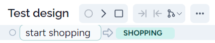
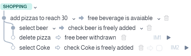
First, it’s reasonable to implement the initial state ‘SHOPPING’. We made a single action:
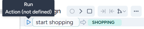
Then hovering the mouse over the single node: it changes to a play icon:
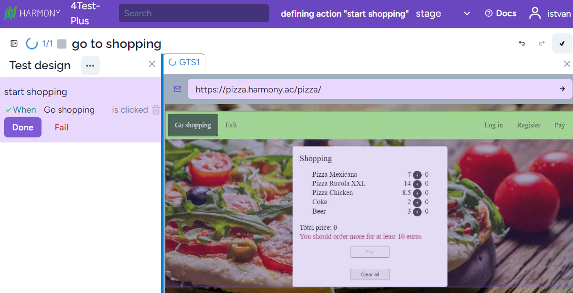
When you click on it, the application under test opens and the action on the left hand side tells you what to do:

then click on the ‘Go shopping’ menu item in the top left:
Harmony generated the low-level model step: ‘When Go shopping is clicked’. In addition, you can see the OK symbol next to ‘When’. This means that this step is automatedly executed and passed. Pressing Done, we are ready to implement the initial state. If the action or the response has all the necessary low-level steps, then let’s press ‘Done’.
Note that instead of the manual execution, the automated execution happened. In this way if the automated execution fails you will immediately recognize and after deletion of the step you can re-execute it.
Implementing actions
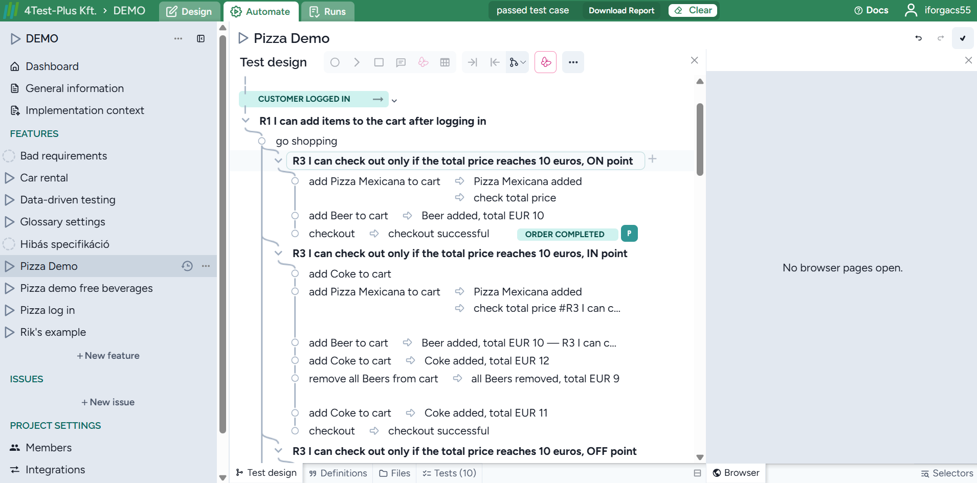
To execute a test case we should select any step in the model. Let’s select a node in the first test:
Clicking on the play icon we arrive at the initial state by executing the single step ‘start shopping’, i.e., the Shopping window is displayed, with the first action in the model:

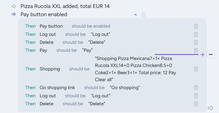
Now we have many opportunities to reach 30. One possibility is to select a Pizza Rucola XXL and then two Pizza chickens. Just clicking on them we get:

The pizzas are added successfully, we can press Done.
You can also fill out a field, by just clicking on it. A new box will appear and you can write the text into this box. Let’s demonstrate the login feature:
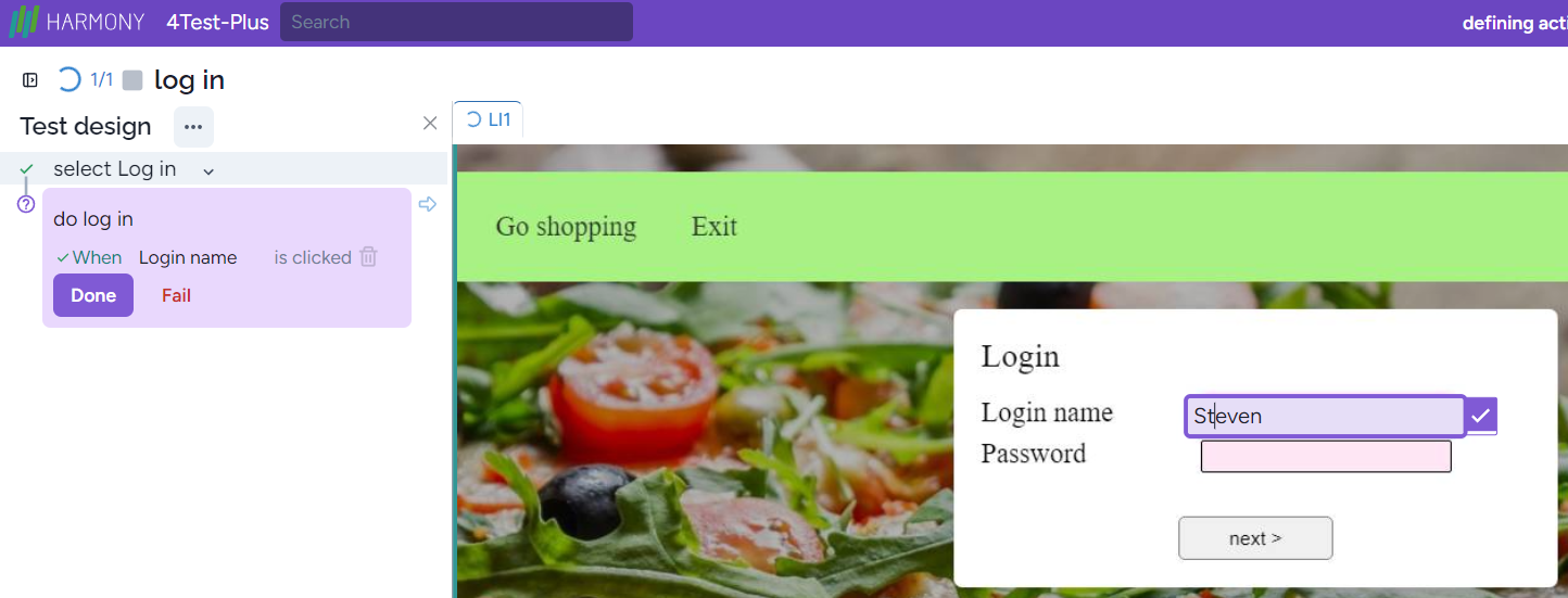
then press the OK icon or Enter. In the latter case the Enter will be a separate low-level step:

Pressing the OK icon only the first low-level step will be generated.
Special characters and character combinations
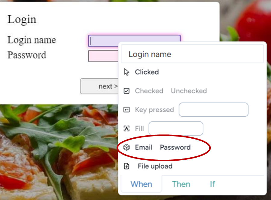
Sometimes you should use some special characters such as ‘Esc’, ‘Delete’ or you need to simulate clicking the right mouse button (Shift F10). In this case, you just enter these characters and they will appear as low-level steps immediately. For example, clicking on the Password field:

then clicking on ‘Esc’, then Shift + F10, we get:

that is two new steps are generated while the field remains empty. If you press Shift with a letter, then it will be capital, etc.
Attributes
In some cases clicking on a UI object or filling out a text field is not enough. For example, when you check or uncheck a checkbox, clicking is not a good solution, i.e., if you click on a checkbox will modify the state of it, from checked to unchecked and reversely. On the other hand, if check a checked checkbox, then nothing happens. I this way you can set the required output of the checkbox independently of its initial state.
To handle other necessary actions, click the right mouse button :
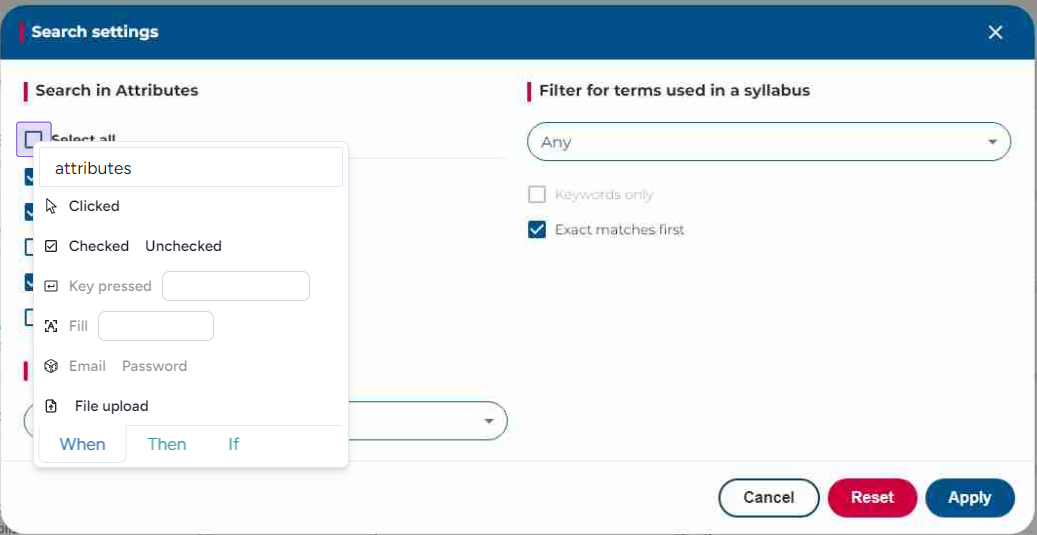
You can click the selected UI element, check, uncheck, enter some control keys such as Shift + F10, and add some text. If you need to enter email addresses or passwords, you can use the related commands:
The result is a randomly generated email address/password:

Currently, you cannot use File upload.
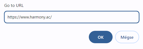
Sometimes you should open a new page (URL) in the middle of a test case. To do this simply click on the URL field:
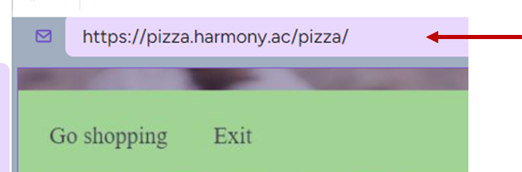
then fill in the required URL:
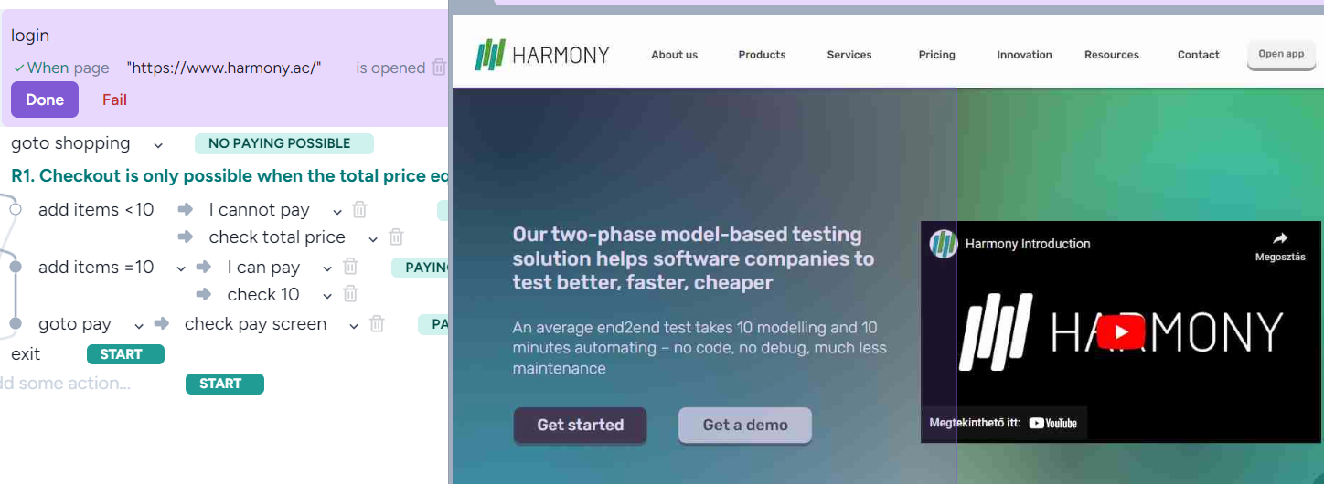
The result is a new low-level step (on the top of the left-hand side) and the new page appeared:
Conditional step
The conditional steps are used when the system is not in a predetermined state. For example, at some point, the system is in a logged-in or logged-out state. If the latter happens, then you should log in, but you can only do so if you are in the logged-out state and the login UI object/selector is visible.
To do this select If:
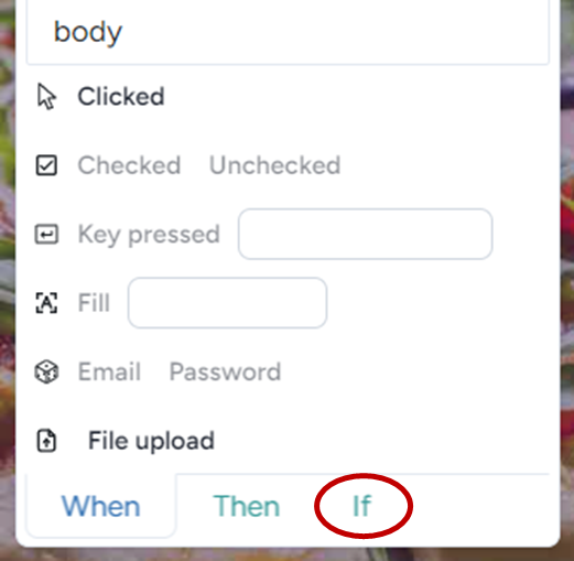
then ‘Visible’ or ‘Not Visible’:

Implementing responses
When we implement a response Harmony knows that in this case, some validation happens. Therefore, when clicking on a UI element, this click will be transferred to a validation of the value of the clicked UI element,
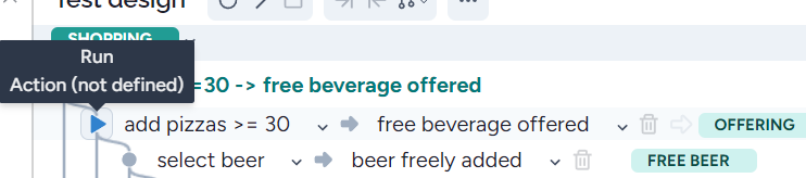
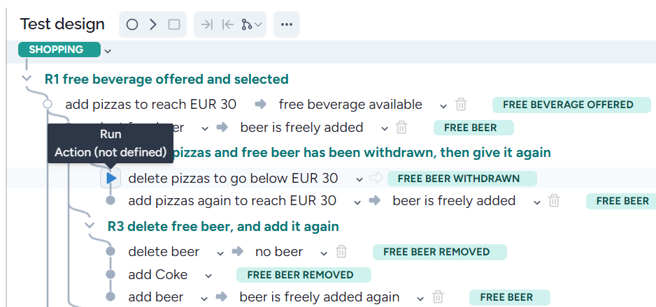
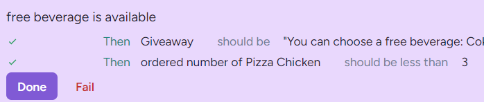
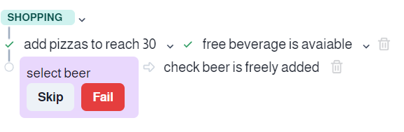
Let’s continue executing our Pizza application. After implementing an action, the next step is the response (check that a ‘free beverage is available’). We should hover the mouse over the message ‘You can choose a free beverage’:
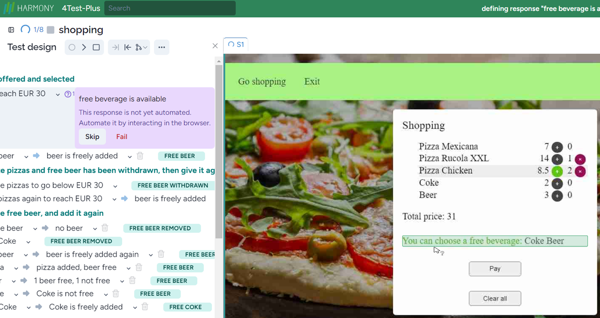
and click on it:

It will check the whole text ‘You can choose a free beverage: Coke Beer’. Pressing done, the next action will be asked.
Though in most cases value verification or object visibility checking is enough, sometimes other checking is necessary. To do this click the right mouse button:

The first line consists of the name of the selector, here ‘ordered number of Pizza Chicken’.
Now you can select whether a UI element is visible or not visible, enabled, disabled, focused, not focused. Sometimes it’s enough to check part of a long text. In this case, you can use ‘Contain’ or ‘Not Contain’ if you validate that a given text fragment is not in the result. To do this, just enter the text and select ‘Contain’ or ‘Not Contain’ as appropriate.
If the UI element is a checkbox, then you can validate both ‘Checked’ and ‘Not Checked’.
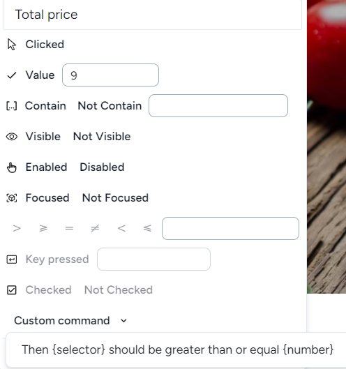
If you want to compare an expected result with the actual result you should write the expected result first:
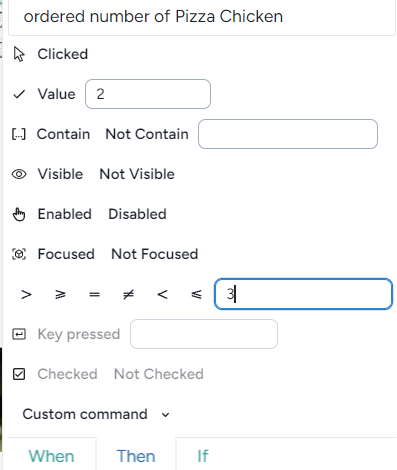
then select the appropriate operation (<):
It can frequently occur that a validation requires some preceding ‘click’ actions. Therefore there is a single element ‘Clicked’ that is an action (input):
Splitting steps in one action or response
If implementing a single action or response results in too many low-level steps, you can split them into two parts.
Just click on the three dots:
and select Split action/resonse here:
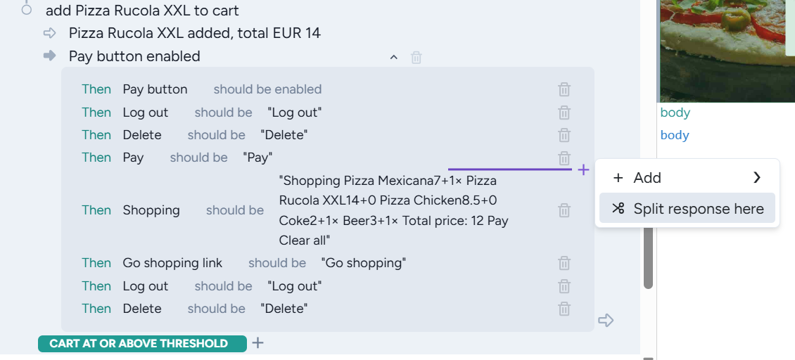
Then Harmony splits the actions/responses into two parts:
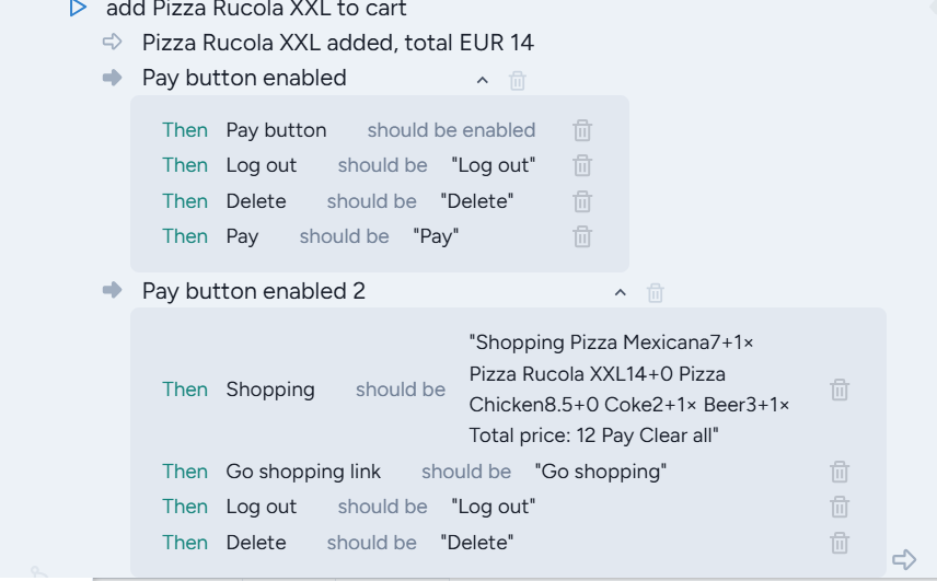
Where the new action/response gets the same name as the original, extended with 2.
Commands
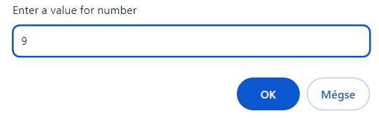
When you need to use a custom command select ‘Custom command’
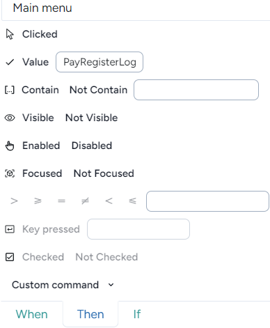
then select the available commands appears (here just one)
Clicking on it you can enter the required number:
To add a new command visit ‘Commands’.
Incremental test automation
Modeling should be done prior to coding, right after the sprint starts. In this way the requirements can be fixed, decreasing the total costs of the SDLC and improving quality. However, it can occur that the application is ready, and the team wants some automation. In this case, it’s much simpler to make a model step, execute the step, and generate the low-level steps and the test code, then make the next model step, implement it, etc. In this way, you should think only one step ahead
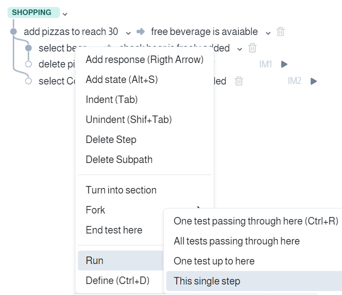
The process is the following. Let’s write a single high-level models step (for simplicity we omit labels and states), then implement it:

Write the next step, then open the menu, select ‘Run’, then ‘this single step’:

Now you can implement, the current step:
In this way, you can a model based on the application. Remember that in this case, you should also consider the requirements.
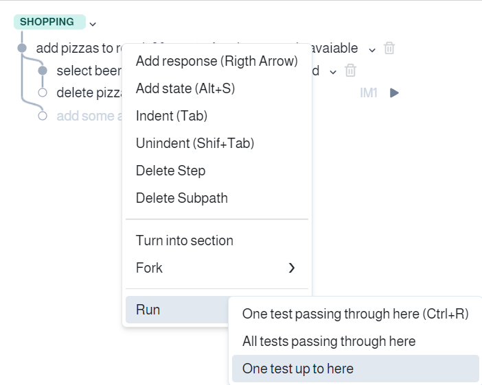
Now let’s assume that you implement a test and you want to implement another one for which some test steps have been implemented. First, make a fork:
then execute the test until the fork, i.e., select the first action, and open the menu:
select ‘One test up here’:
add the new step:
Run this new step:
Now you can automate this step:

Creating tests for non-visible UI elements
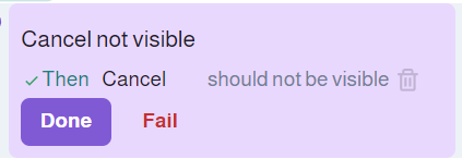
Sometimes we need to check that something is not on the screen, i.e., it’s non-visible. To create such a test, you should have an opposite test, where the same element is visible, to learn the selector of the non-visible elements. If you know the selector, then when you are in the implementing/automating mode, use the ‘Selector’ feature, choose the selector, and click on the non-visible icon:

The result is a new step: